Skills
Art Direction, Research, Photography Curation, Digital Collage, Layout, Copywriting
Timeline
7 weeks
Tools Used
Photoshop, InDesign, Illustrator

CHALLENGE
My challenge was to research the subject of interview technique and hidden psychological indicators that can help or hurt your appearance and presentation. Then to distill and organize the information into a fun but informative little pocket-sized guide.
GOAL
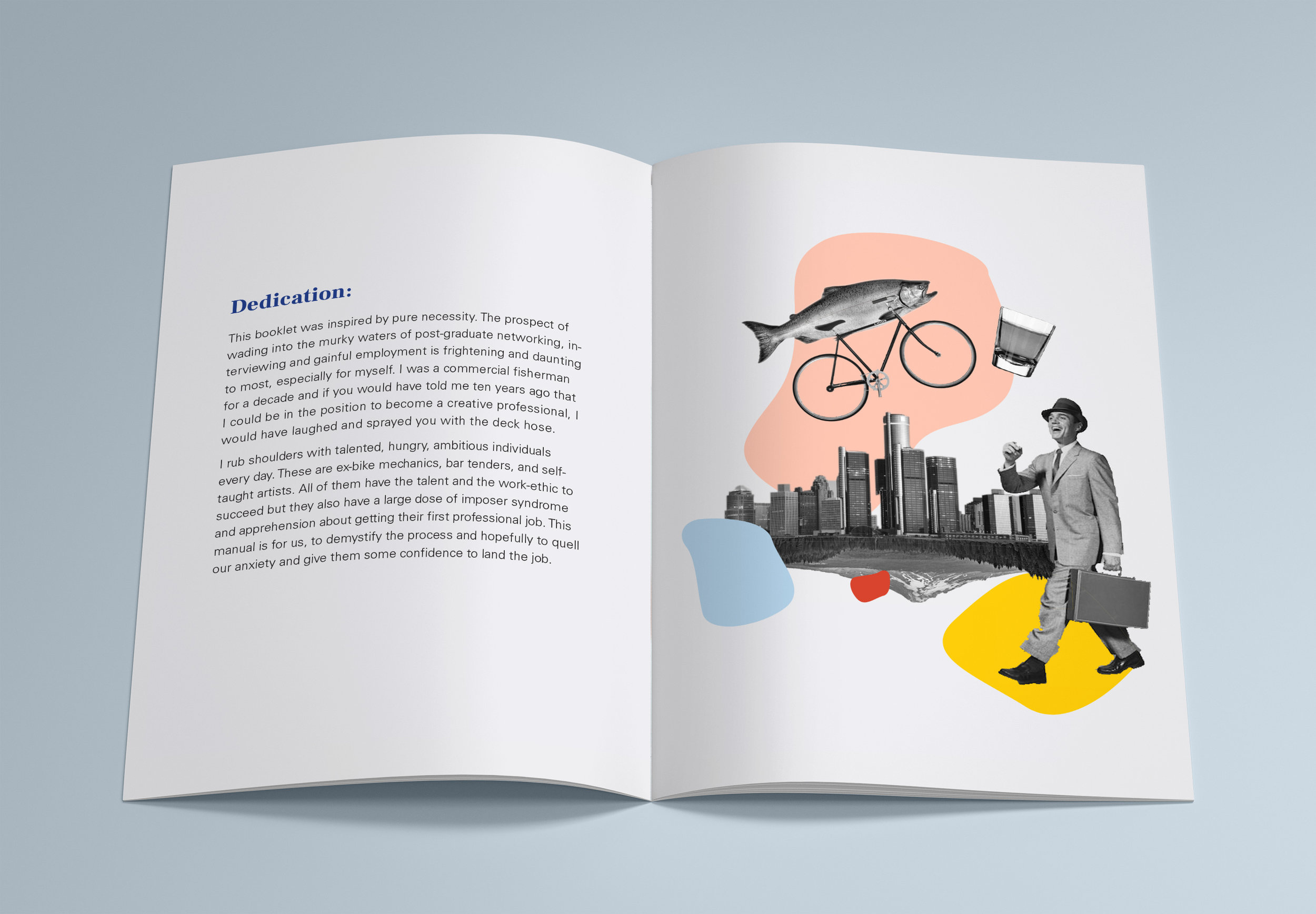
To compile research that shines light on the subject of getting a job effectively from good interview technique. The narrative is based around my background as a commercial fisherman and someone who feels foreign (not to mention very intimidated) to professional standards/etiquette in hiring.
SOLUTION
“The Fisherman’s Guide To Landing A Job” is fun, informative, sincere and charming. It achieves this through the design but also with the touch of personal narrative. I hope that it offers some insight and comfort to others who feel intimidated by the professional world. It is a project that I hope can be improved and built on over the years.
PROCESS
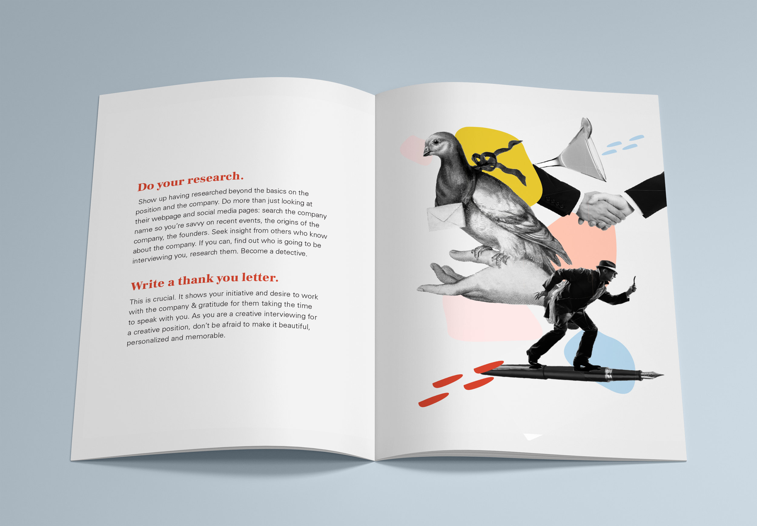
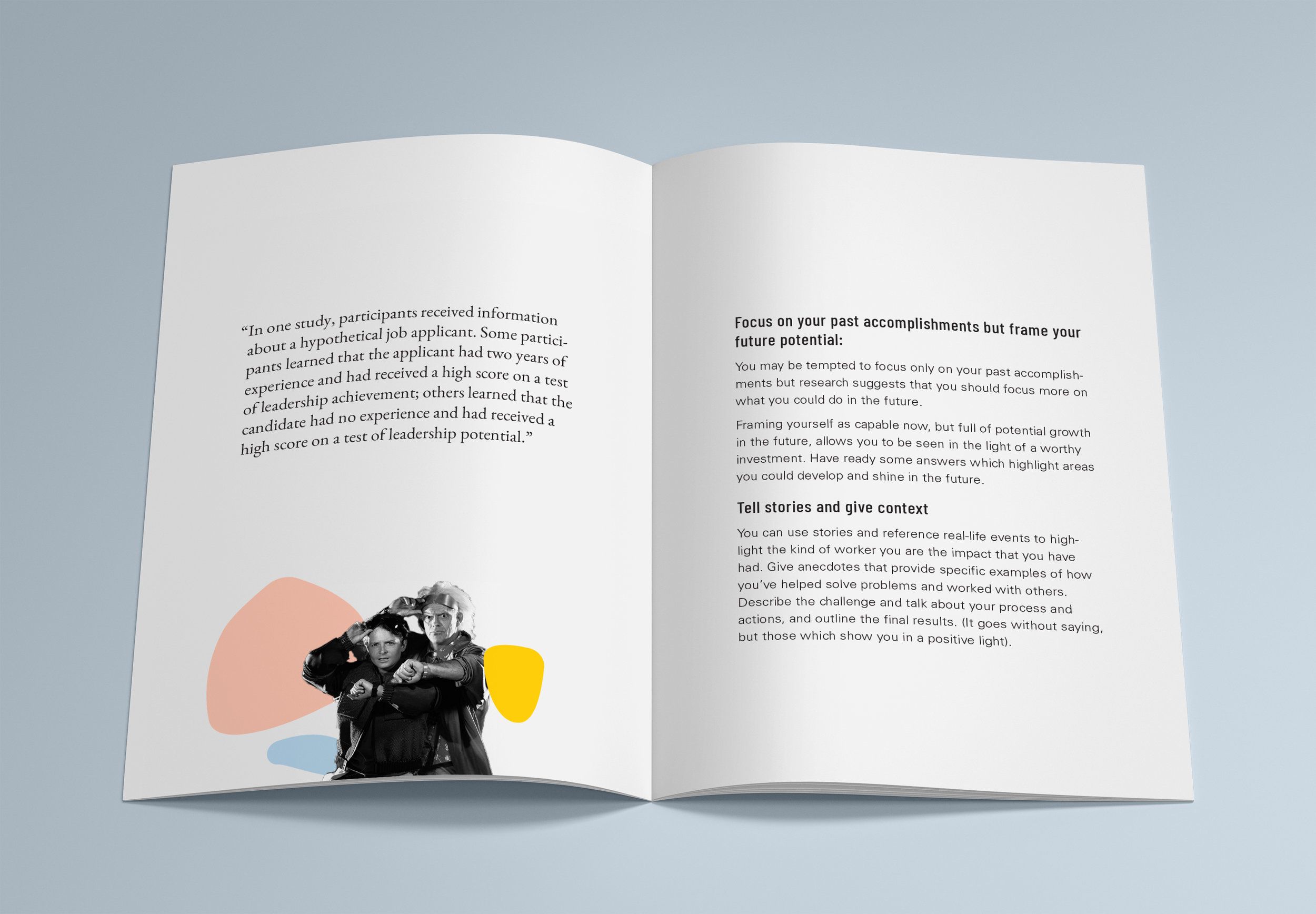
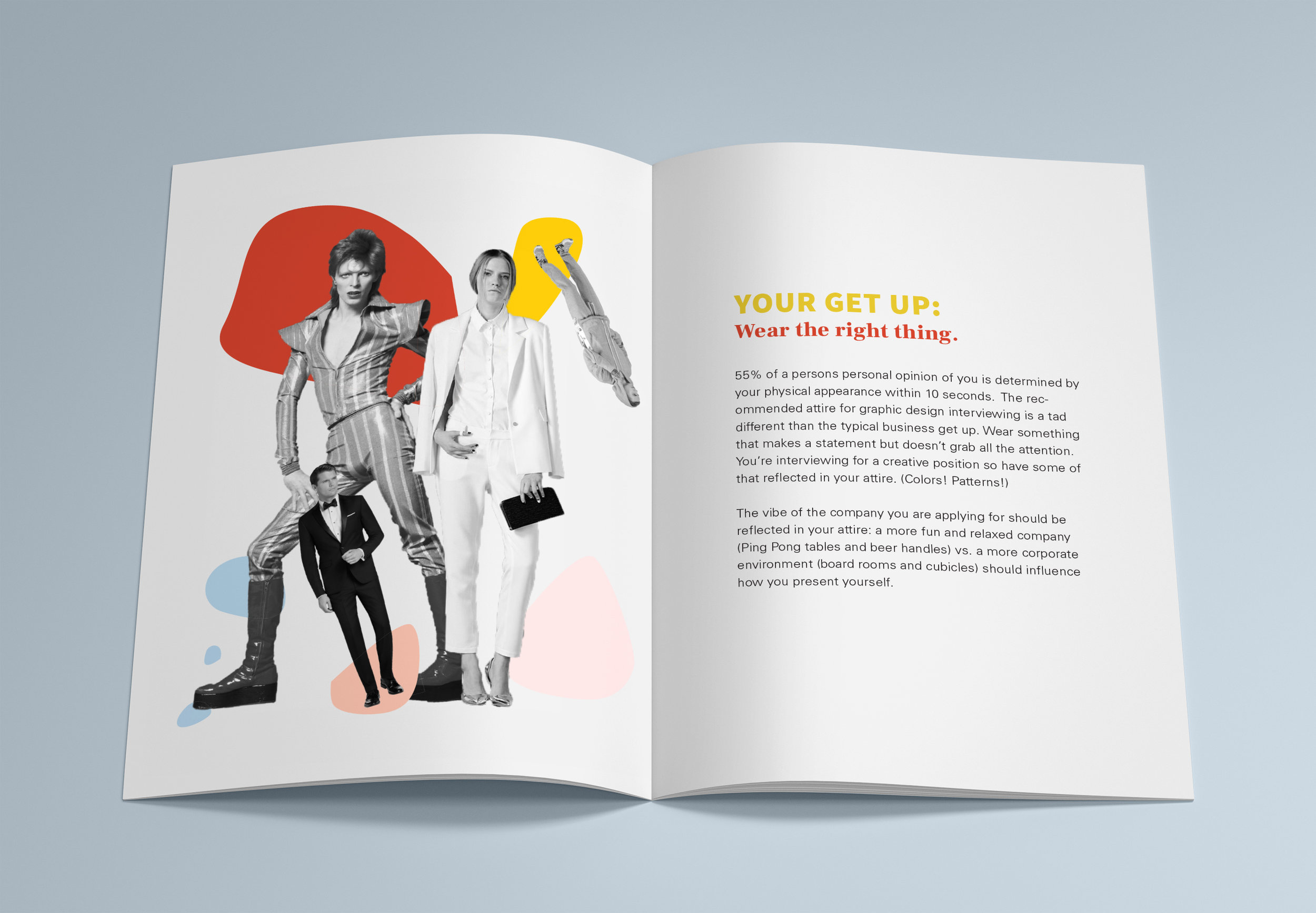
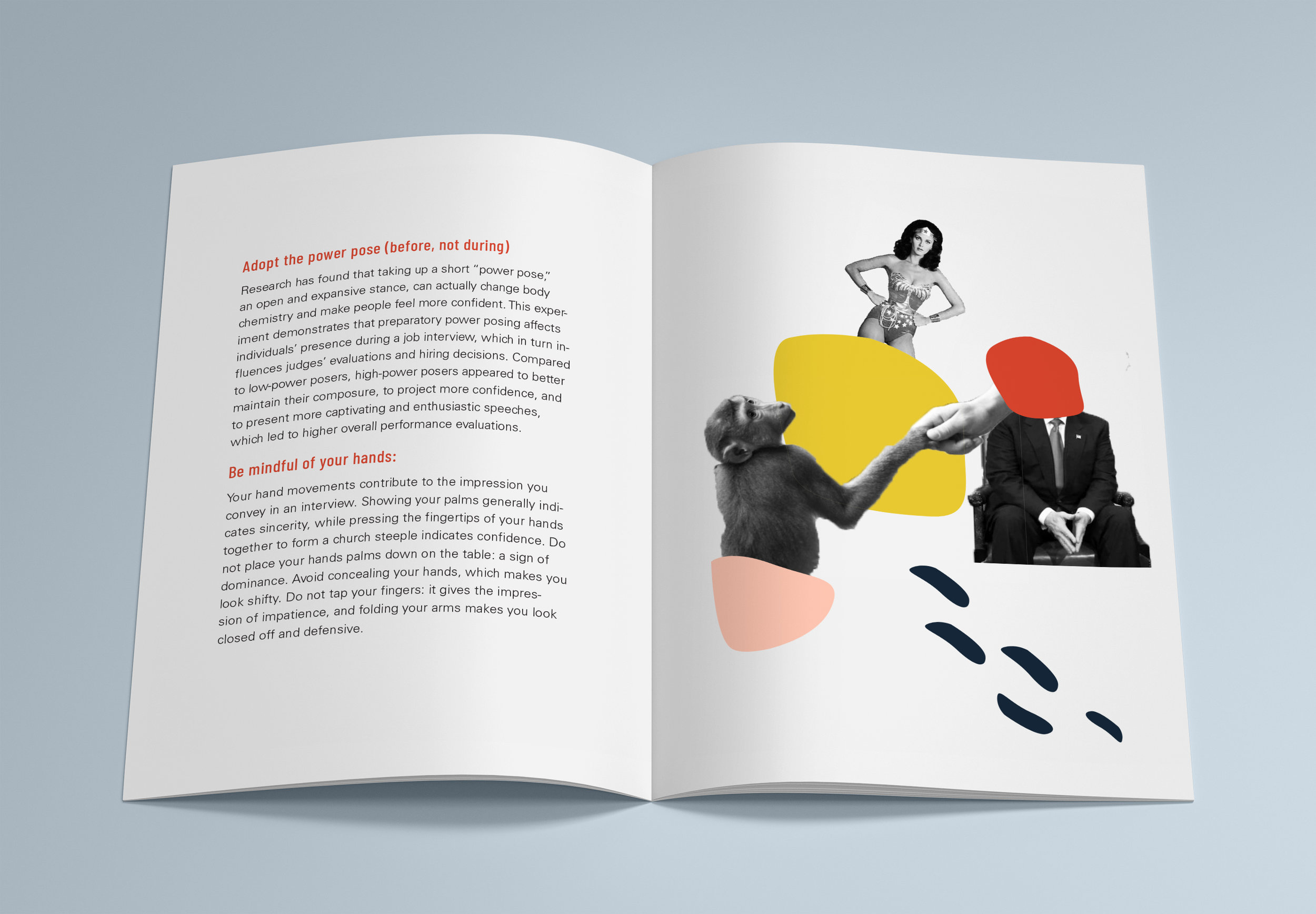
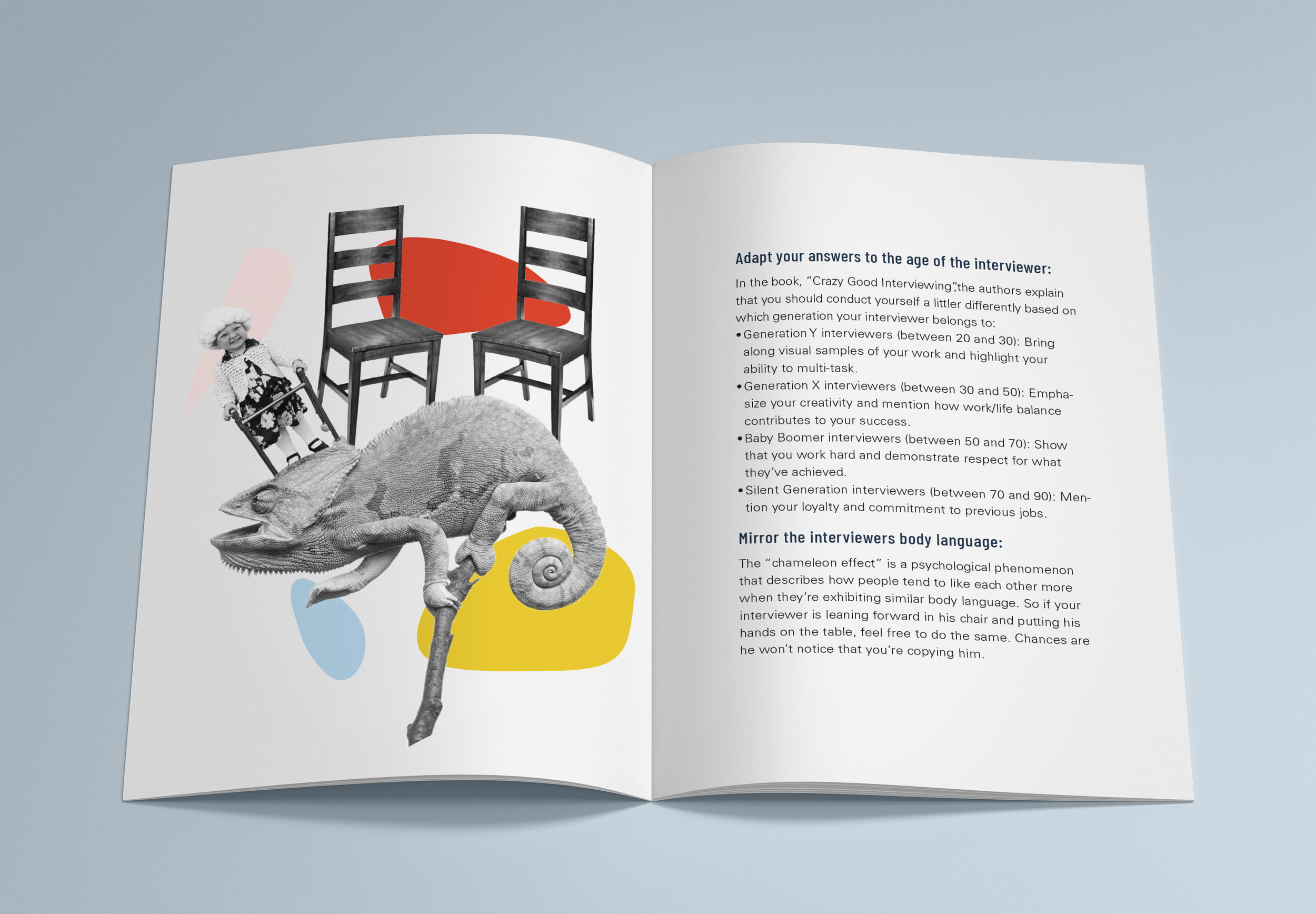
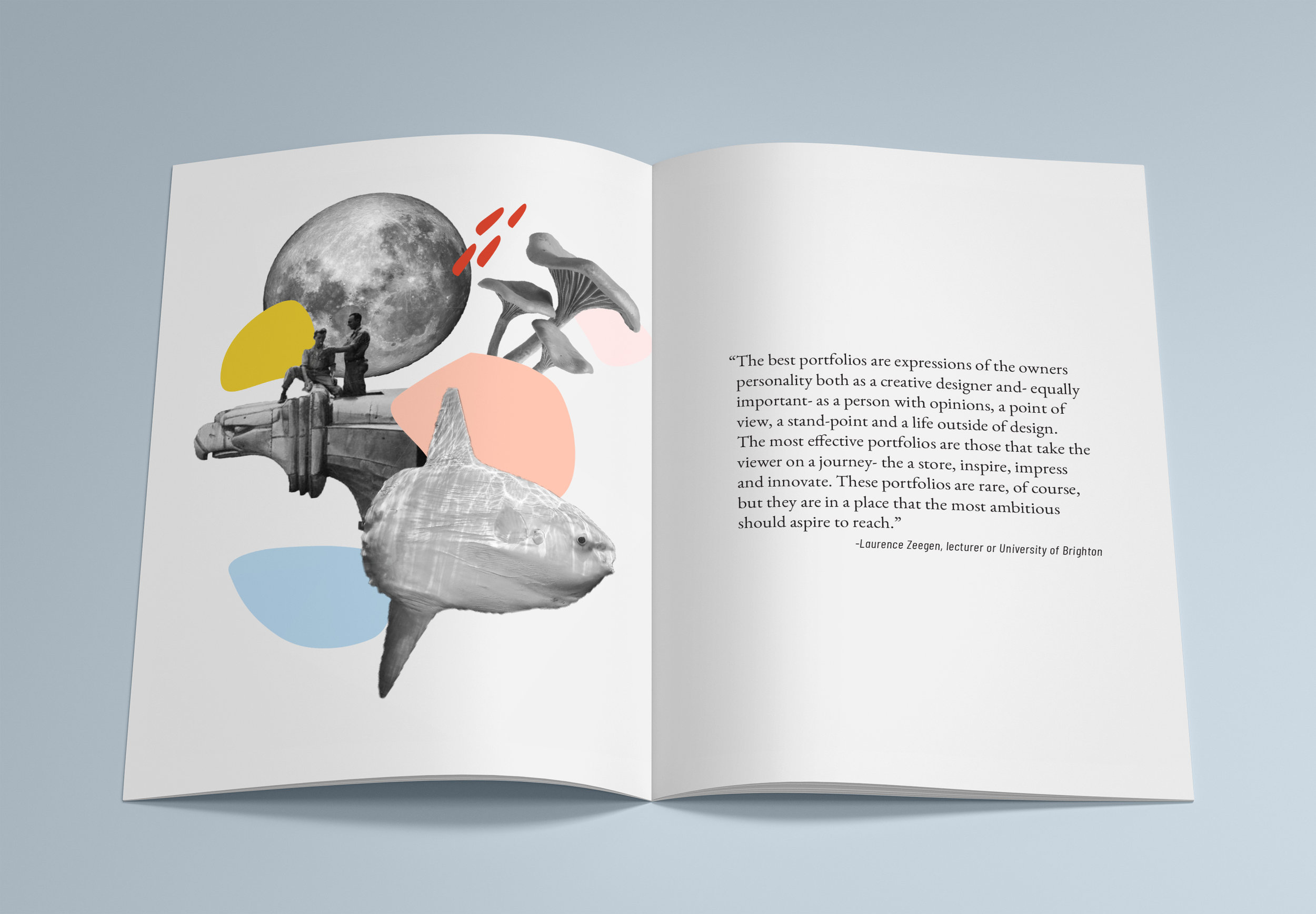
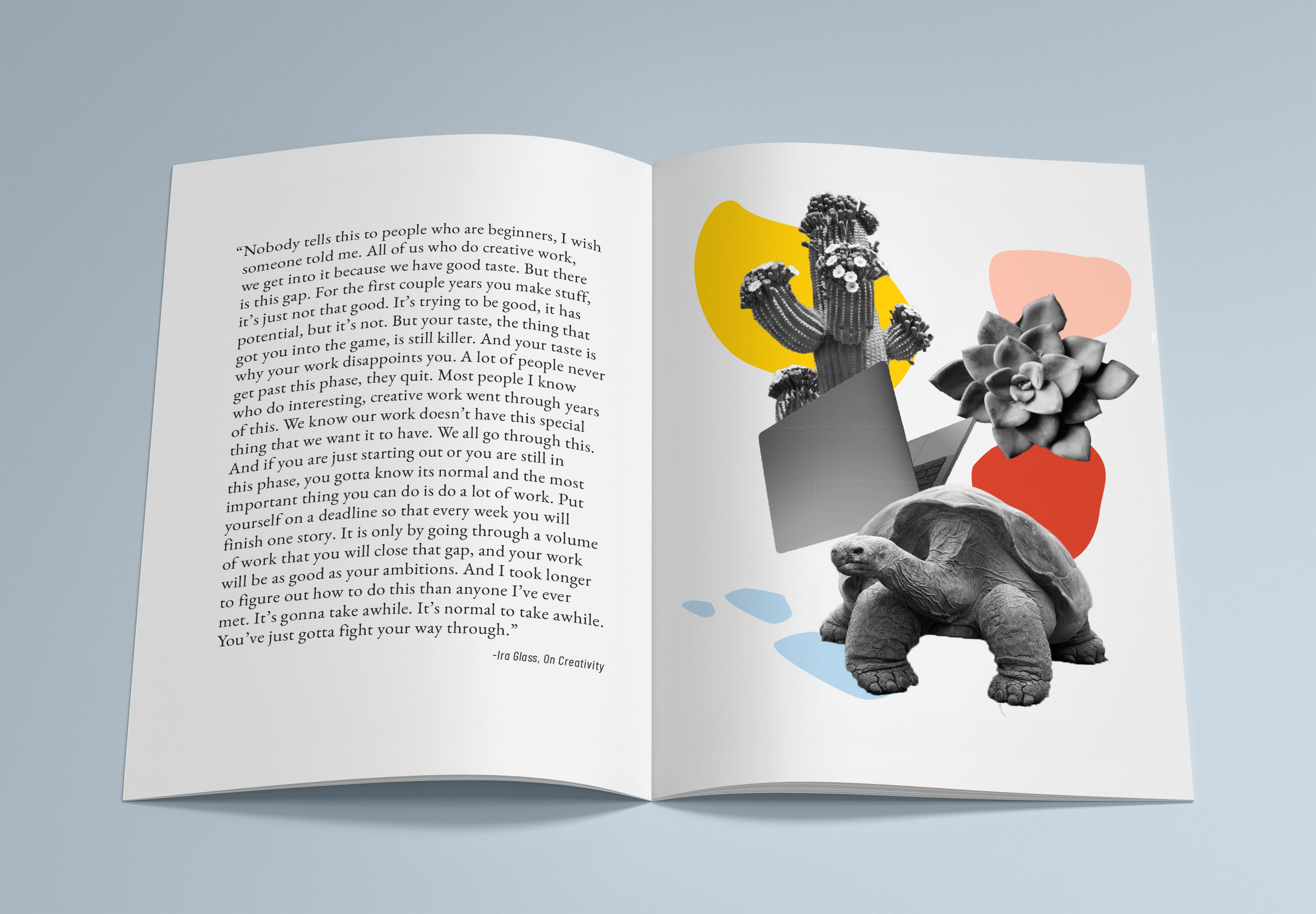
I started this project by spending two weeks researching and consolidating my findings into categories. I translated my findings to copy that was frank but with a friendly conversational tone. Next I made a mood board and established the aesthetic of the book. Establishing the visual tone took some time as I wanted it to be clean but have a slightly zany, exuberant and lively feel. I settled on carefully structured type treatment so it was easy to read, tidy and very legible. Producing the collages was a 21st century digital treasure hunt. Collages subtly reference the content on the adjacent page. The color pallet feels modern and relevant but does not over power the rest of the book.


Click through to see the rest of the guide.