Skills
Branding, Layout, Typography
Tools Used
InDesign, Photoshop, Illustrator

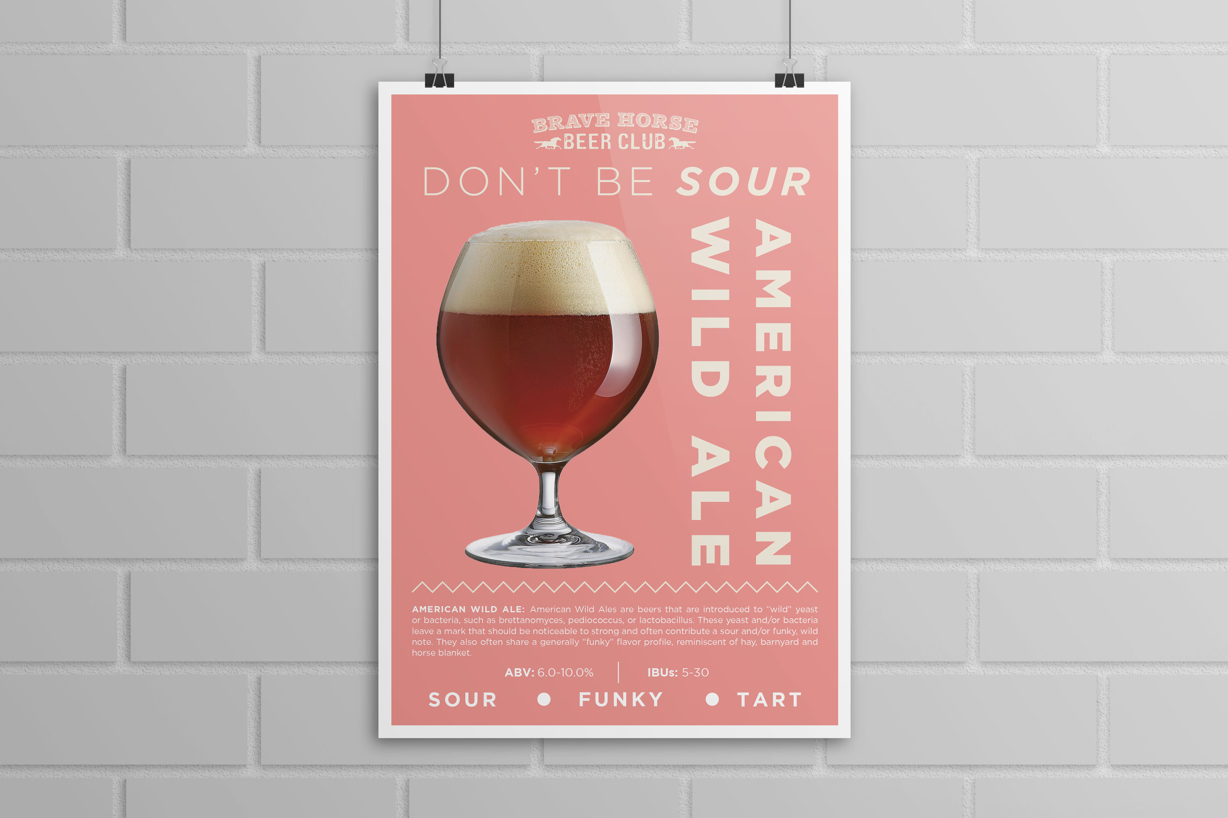
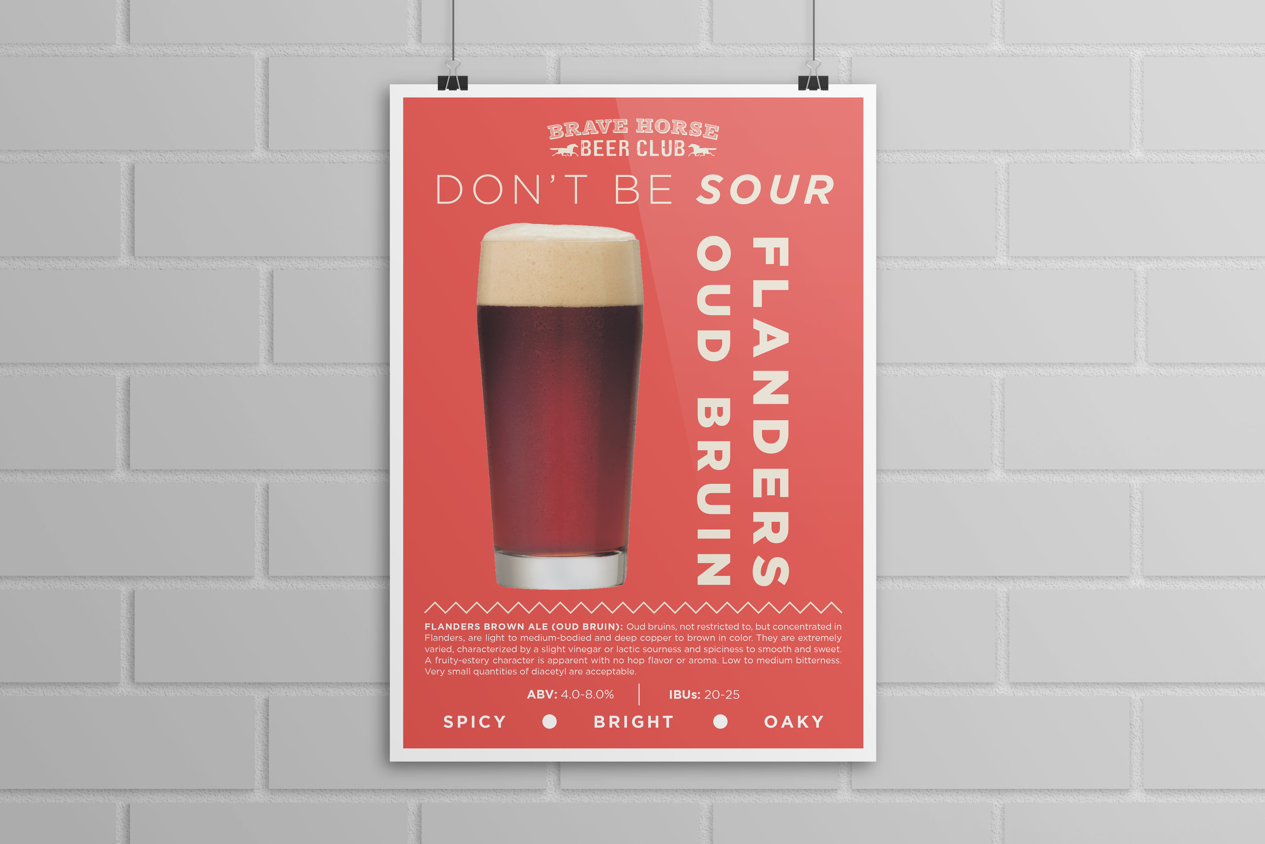
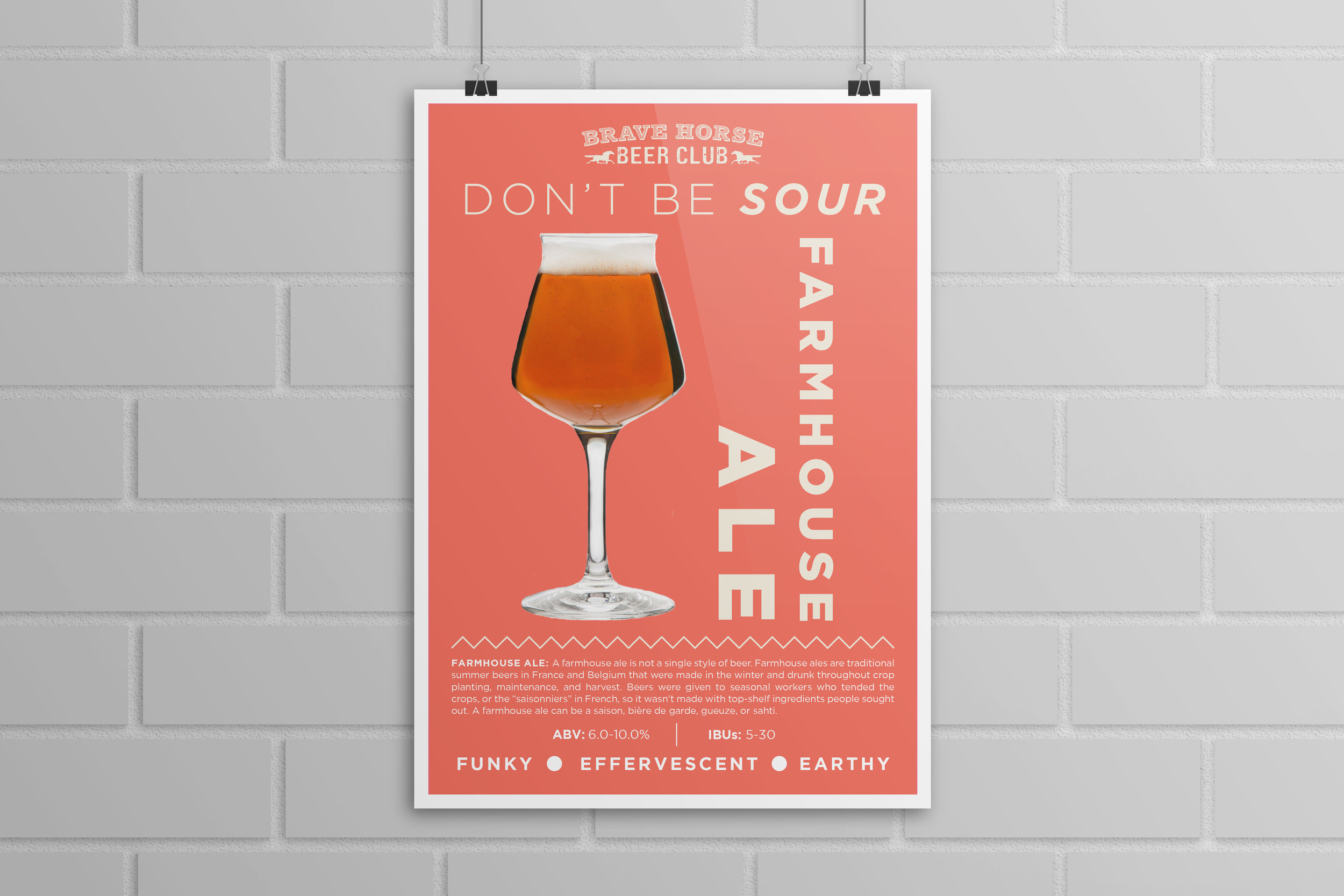
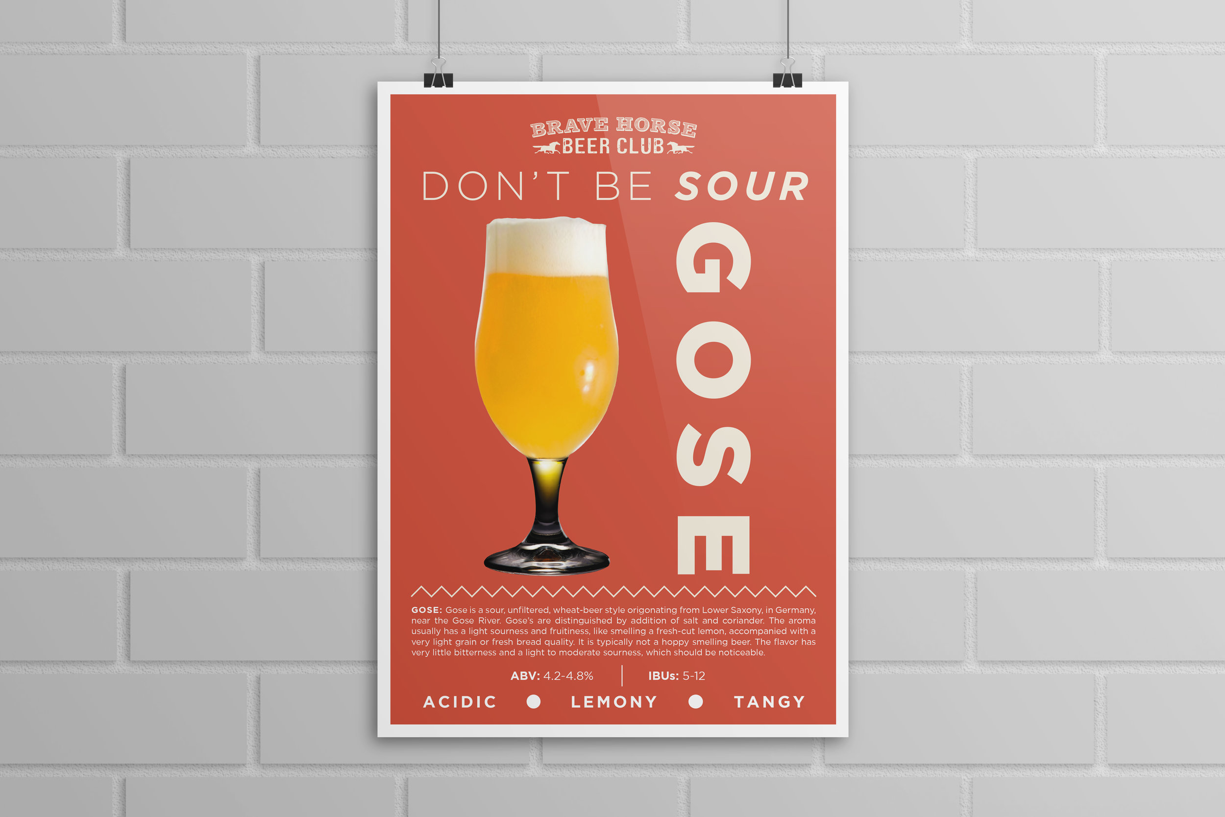
DON’T BE SOUR VALENTINES DAY EVENT
In Seattle, beer is king. Breweries are everywhere, events are happening all the time and craft beer connoisseurs can’t be everywhere at once. So in branding this Valentine’s Day tasting at Brave Horse Tavern- I had to develop a brand that was eye-catching, distinctive, memorable but that didn’t cater just to millennials. I envisioned creating a poster series and collateral that highlighted and complemented the sour’s variation in color, profile and origin. I wanted the event to feel contemporary but inviting, engaging & playful.
The Don’t Be Sour series is balanced in its modern look and layout. It has a call and response between the different elements: the soft and warm background colors, the beer’s unique hue and the bold type. I feel that the series is sensuous, engaging and memorable- fitting for the Valentine’s Day event which featured some of the most contemporary styles of beer in the industry.

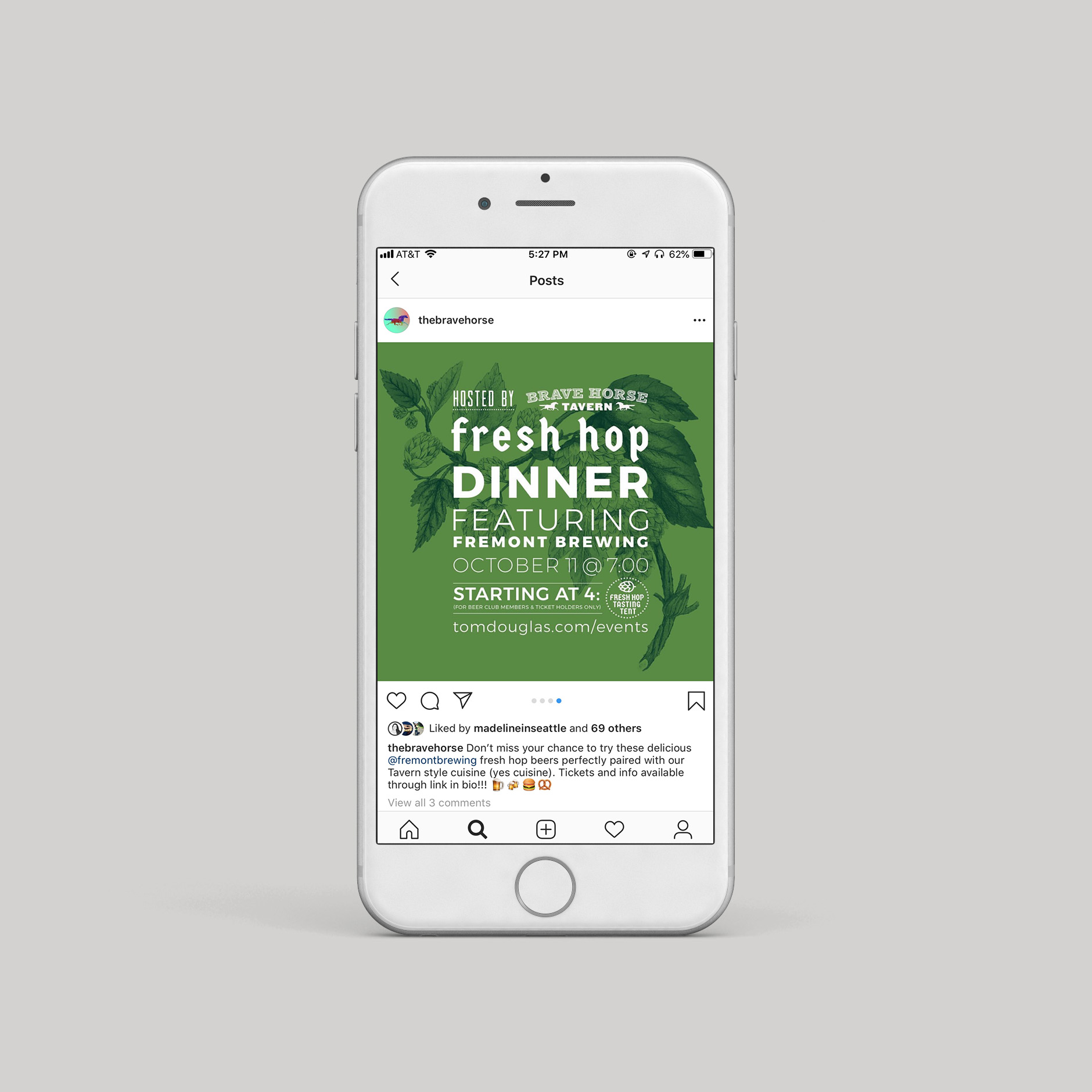
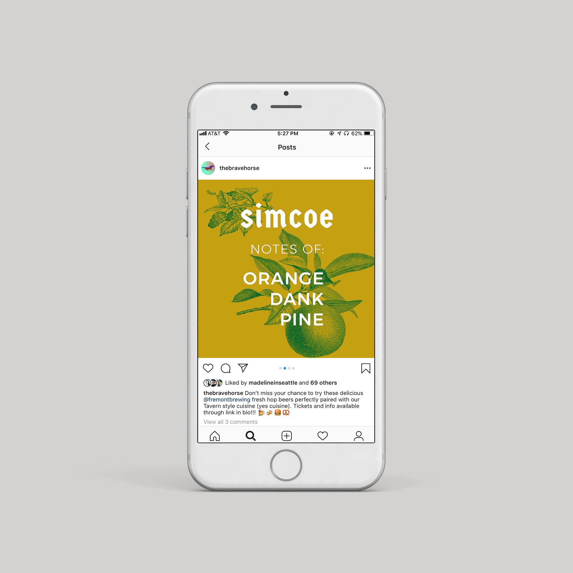
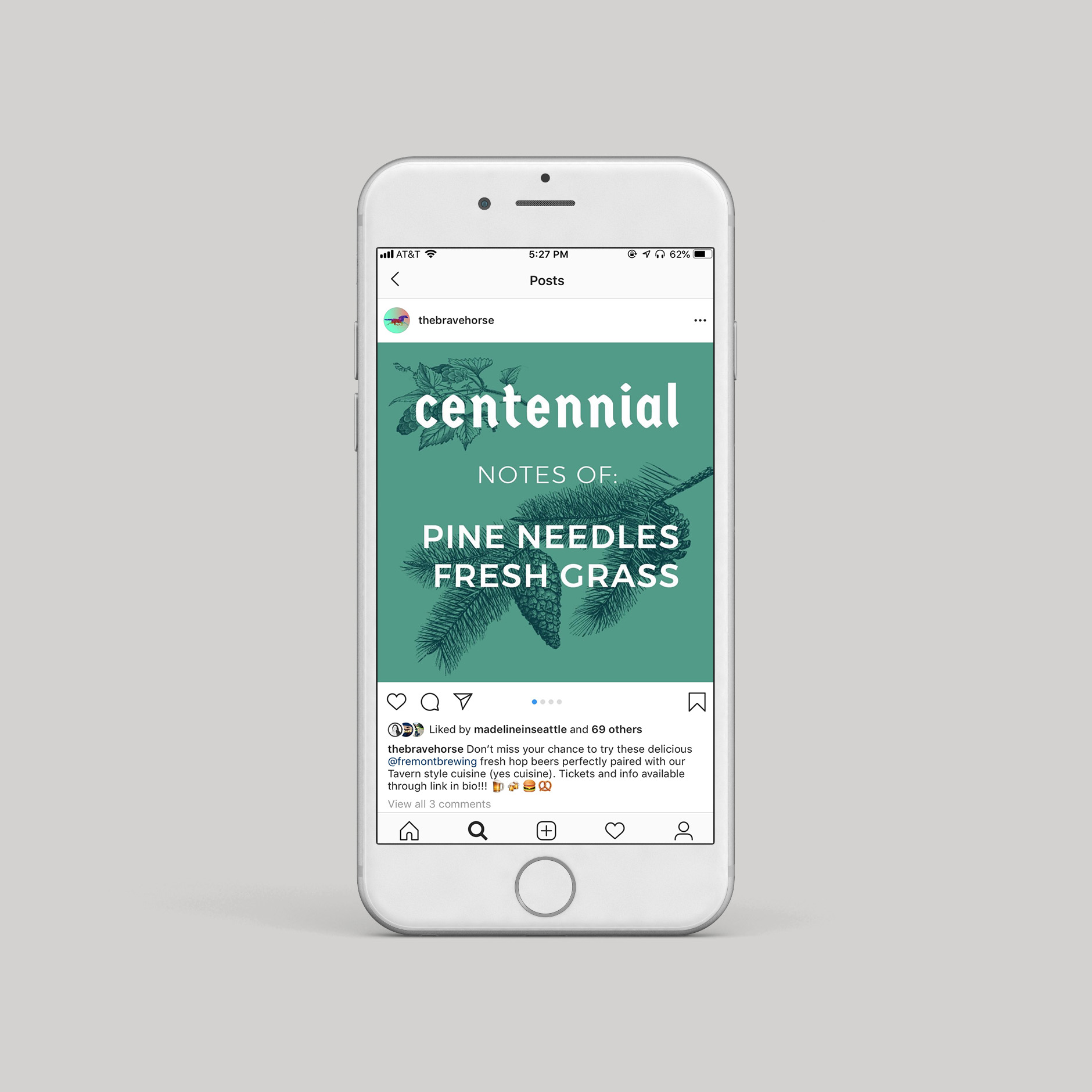
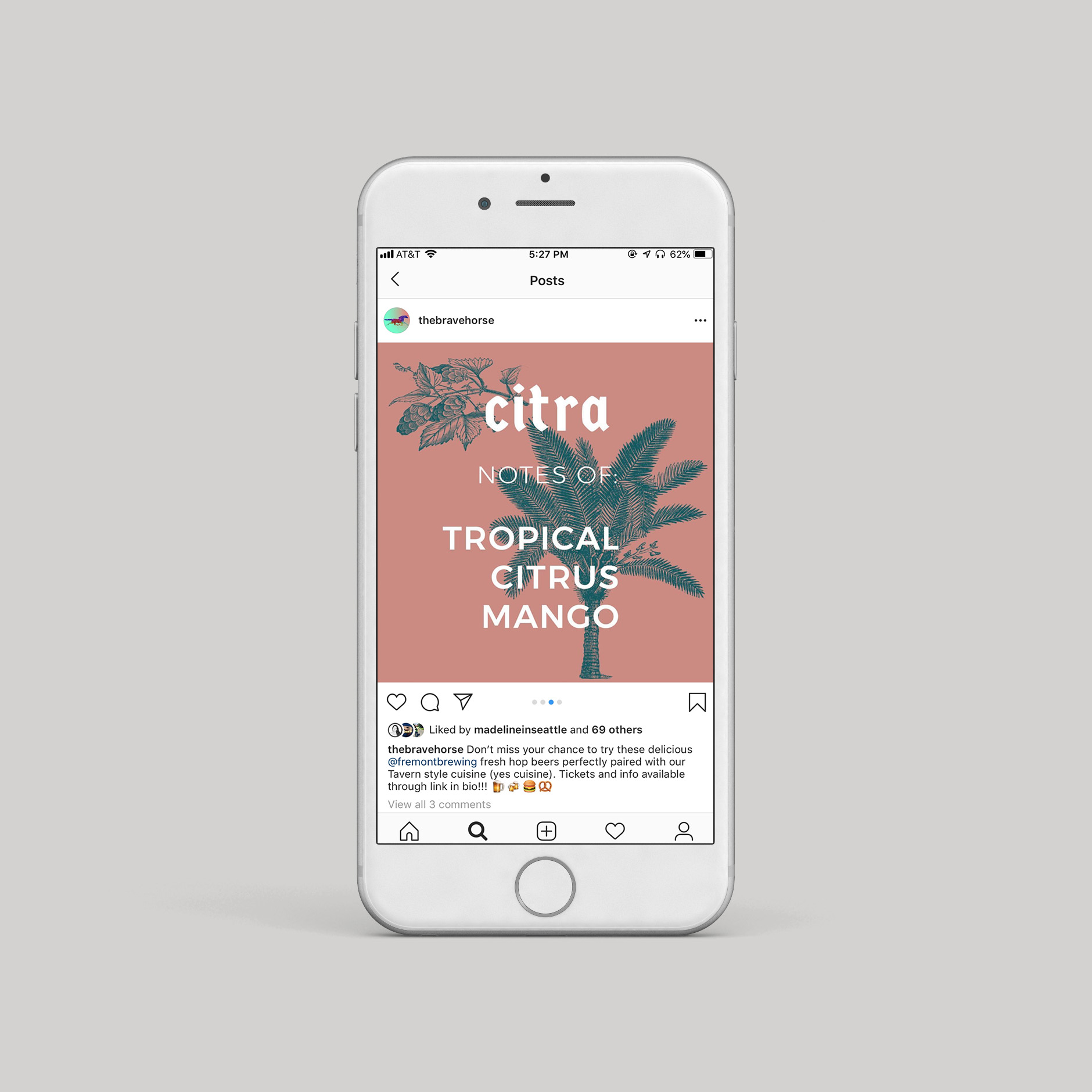
FRESH HOP BEER DINNER
Brave horse Tavern is renowned for its tap list and brewer’s events. Its beer loving clientele is particularly diverse and therefore the challenge in designing this highly anticipated event was to stand out in the Seattle craft beer scene while appealing to a broad base of beer lovers. I wanted the branding and collateral for this event to stand out but not be too attention seeking. I decided to take a more austere and sensory approach: appealing to the hops natural loveliness and its botanical and verdant nature.
The branding and collateral for the fresh hop dinner is confident, rich but understated. I believe that is stately and classic with its antique botanical engravings and muted greens but also strikes a modern tone with the duotone treatments and stacked, nested type treatment.


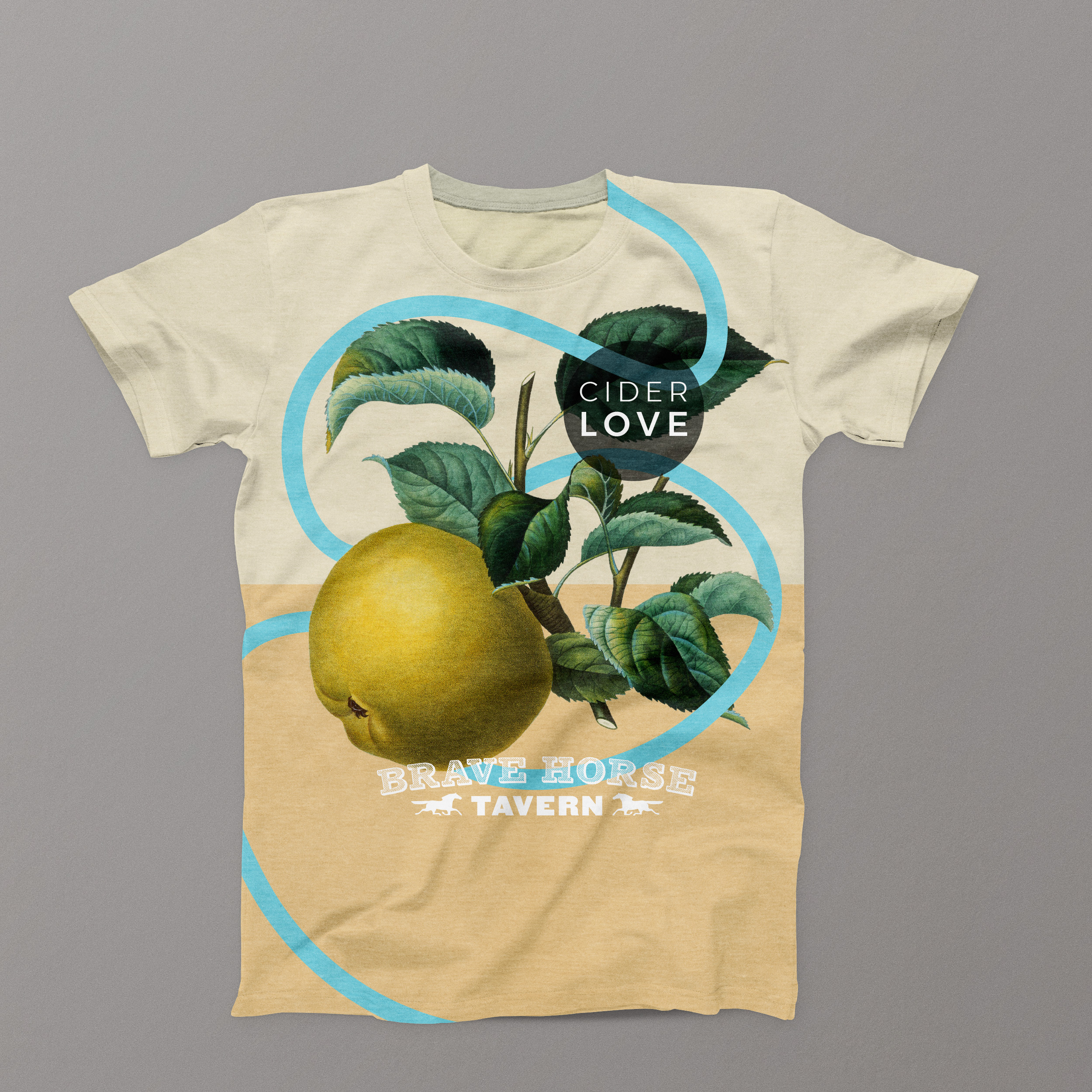
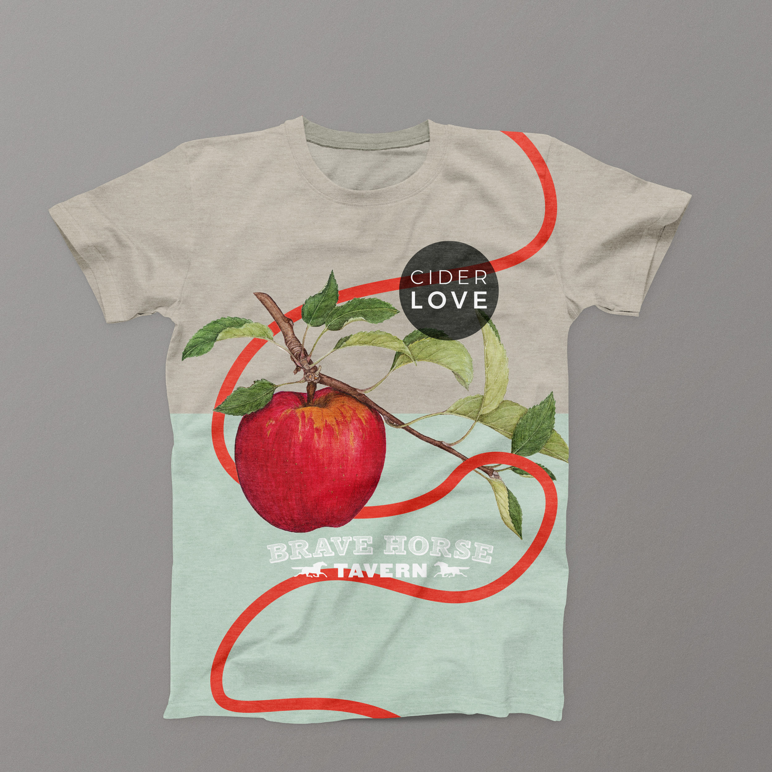
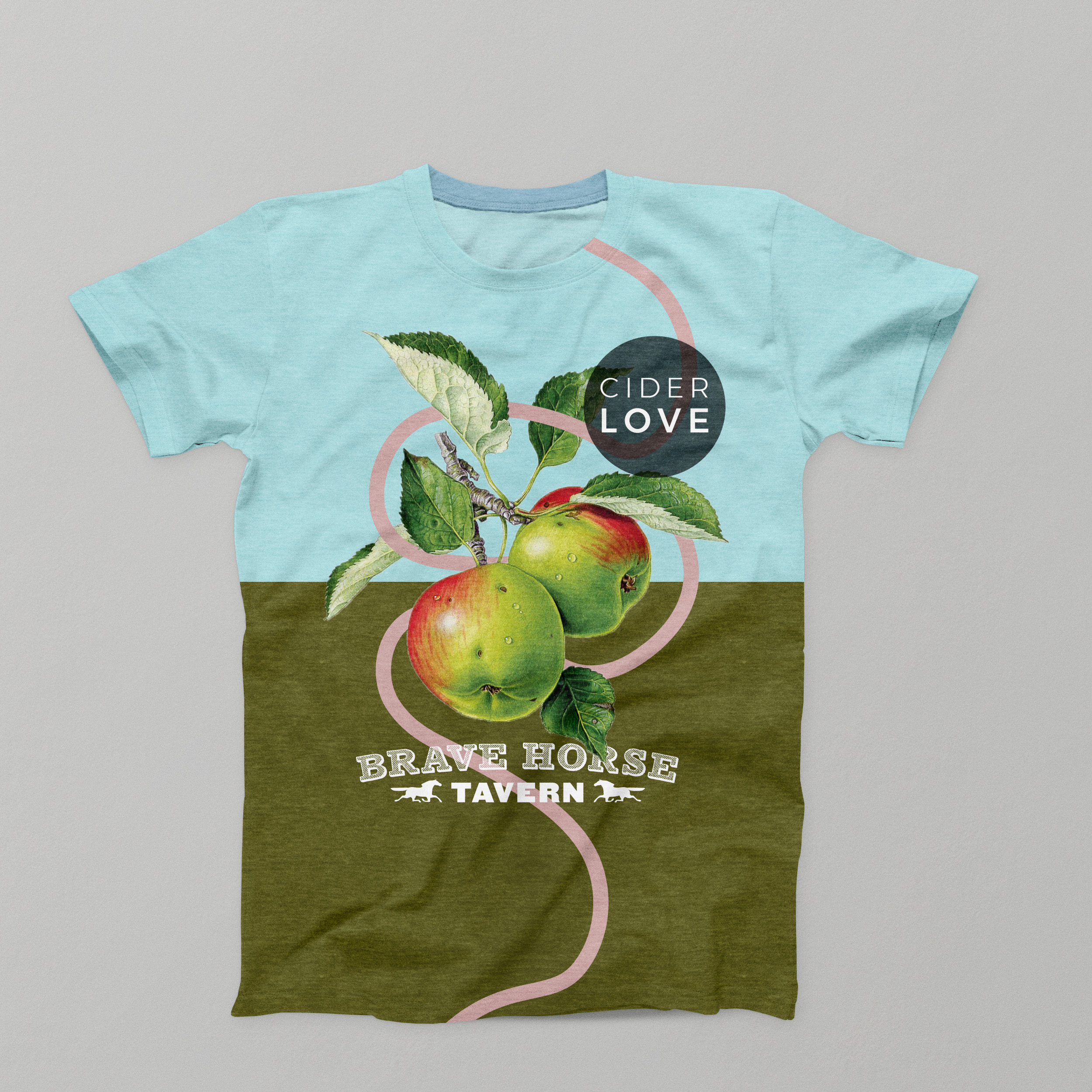
CIDER LOVE
Like sours, craft cider is also having its moment. In Washington in particular- craft cider is gaining a foothold in the market and there is lots of enthusiasm for this delicious alternative to beer. Having worked in the craft cider industry for years, I’ve found craft cider makers to be some of the most passionate and inspired craftsmen and the product they create has never tasted better. The challenge was to express this excitement and to produce a series that was lovely and lively. I wanted to portray the beauty of the product, the process, and the distinct richness of late fall when the apples are harvested.
Cider Love plays with the tension of the rustic and elegant apple illustrations juxtaposed with the more lively and modern elements such as the interwoven pops of color and the modern san serf logo treatment. It feels whimsical but grounded, playful but elegant. The dynamic was successful and I was pleased to have multiple attendees request posters after the event was done.