Skills
Layout, Photo Curation, Typography, Writing, Branding
Timeline
12 weeks
Tools Used
InDesign, Photoshop, Lightroom, Illustrator
CHALLENGE
Making Parsley was a challenge because I was faced (as I have been with most of my projects) with having a very clear vision of what I wanted, yet struggling to have it come to fruition. Parsley’s core themes–food policy and production, culinary collaboration and plain old love of good food– are all areas I’m deeply interested in. As a political science major, I found agricultural policy and to be one of my favorite subjects. The food production element also strikes a personal cord with me: I am the daughter of farmers and commercial fishermen. Finally, I love cooking and more so consuming the fine food offerings around Seattle.
Needless to say when I set out to create a magazine that focused on these themes, I set the bar high for myself.
GOAL
I wanted Parsley to be lovely, elegant and clean but also honest and somewhat raw. To me, showcasing this dynamism between the polished, refined final product and the fairly gritty and sometimes problematic backdrop of the food world was the most important task of making Parsley.
SOLUTION
Parsley is balanced, candid and cathartic. It showcases the broad narrative of the food world while remaining cogent and compelling. It does not shy away from the less palatable topics but addresses them with candor.
PROCESS
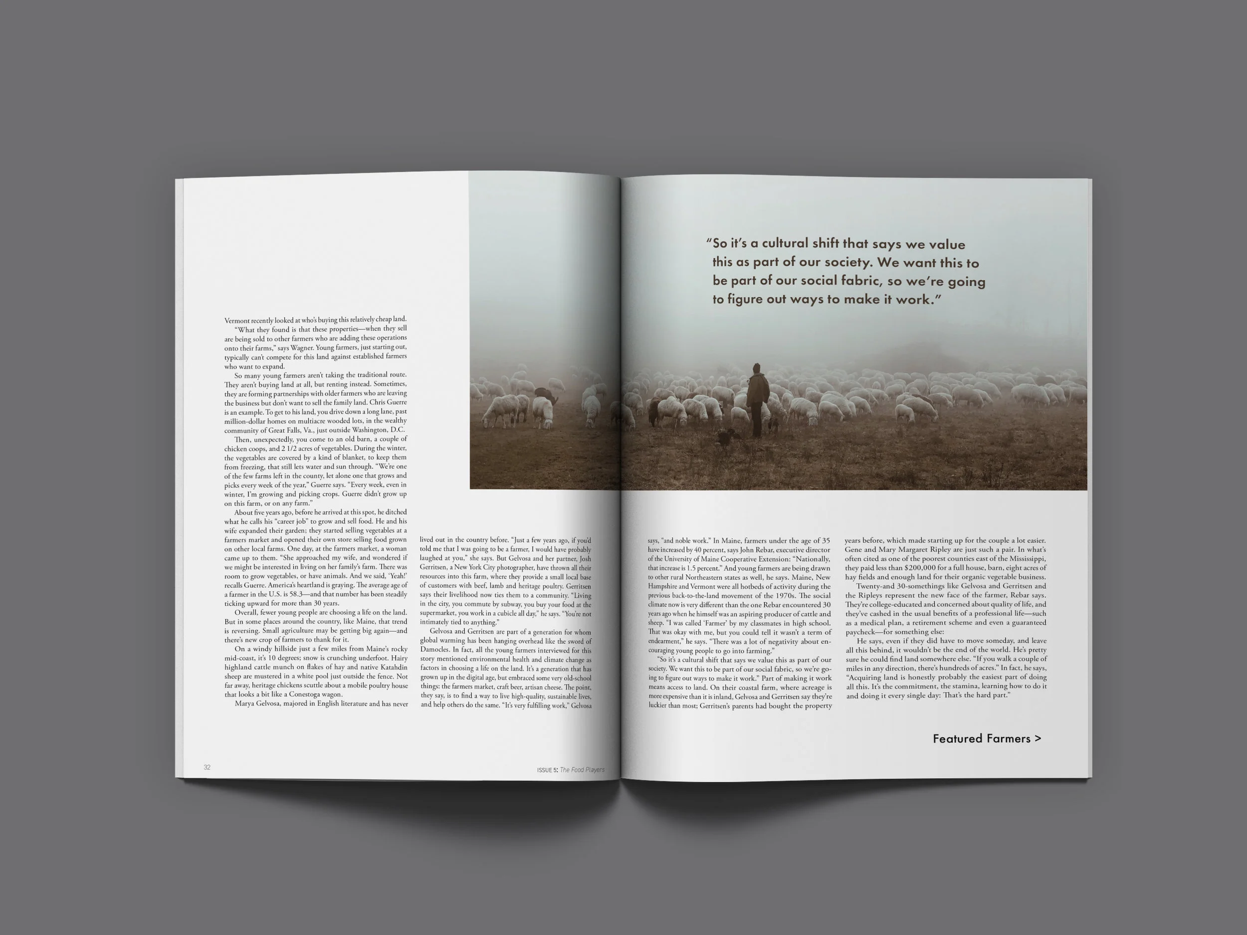
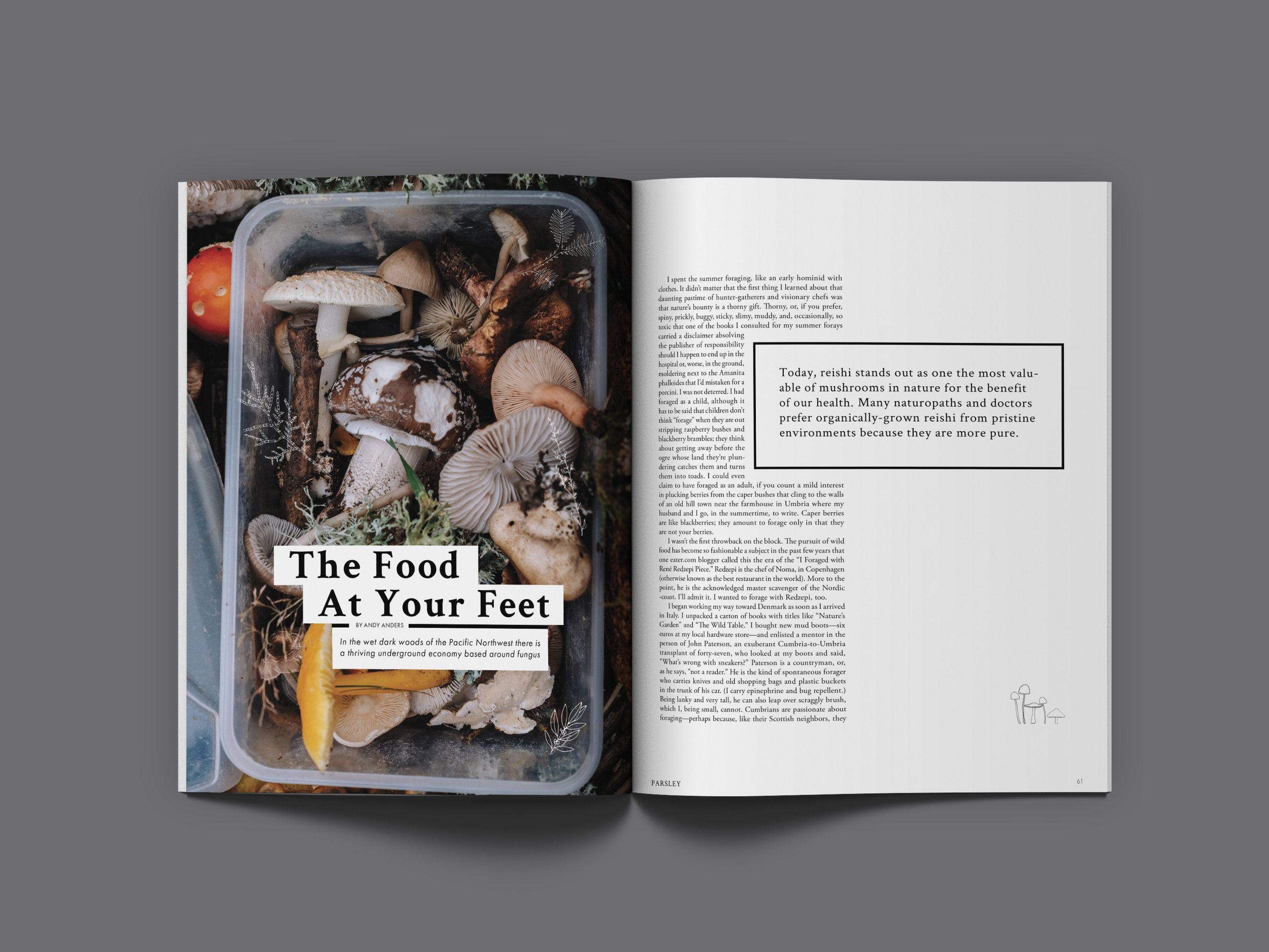
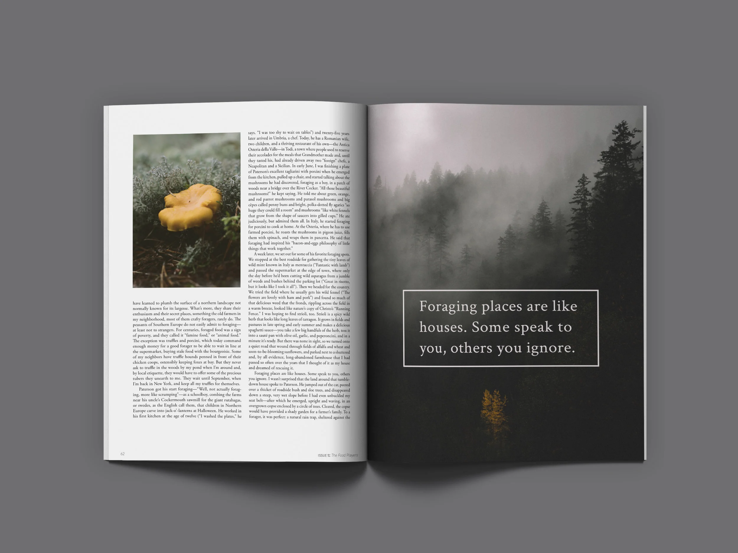
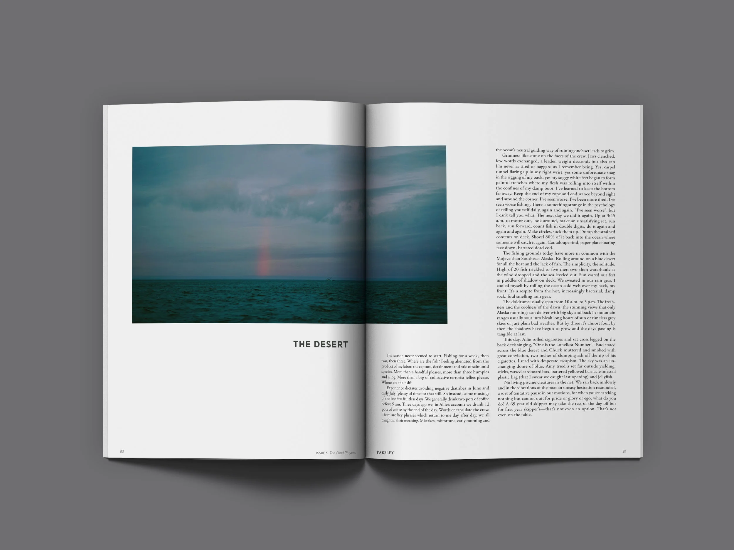
In the beginning of this project, I essentially designed two magazines: one with lovely negative spaces, elegant typefaces and orderly body copy. The other was chunky, edgy and tense. For me, finding the common thread that ran through these story lines and these visual influences was the most difficult task. Over time, the importance of having a strong design system in place became abundantly clear (only after much hand wringing, frustration and dismay). Revising the finished piece, I saw that certain design decisions which I had been sure were just the ticket for coming across as unique and engaging, were in fact awkward and detracted from the cohesiveness of the magazine. The honesty and elegance I had envisioned for Parsley were getting lost in these rebellious design moves. I revised by simplifying my grid, reducing the number of opening spread typefaces and changing my leading san-serif to Futura, which immediately helped in lending the confidence, poise and simplicity I had been looking for. Parsley now tells a more cohesive story, without sacrificing any of the qualities I had in mind when I first began.


